Insights
Read the latest insights from AI-Media. You'll find a selection of blog articles, whitepapers, case studies and more.
Choose content type
Choose solution type
Choose product type
Filter by
Recent Blogs
 Blog
Blog
Breaking Barriers: AI-Media and StreamShark Collaborate to Revolutionize Digital Accessibility
Breaking Barriers: AI-Media and StreamShark Collaborate to Revolutionize Digital Accessibility
Read more
 Blog
Blog
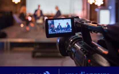
AI-Media and Mediaproxy Announce Partnership
AI-Media and Mediaproxy Announce Partnership to Bring Together Leading Broadcast Compliance and...
Read more
 Blog
Blog
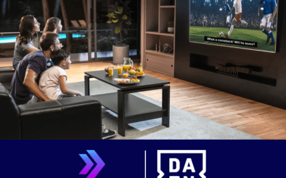
AI-Media Revolutionizes Captioning for DAZN with AI-Powered LEXI Tool Kit
AI-Media partners with DAZN for captioning
Read more
Recent Webinars
 Webinar
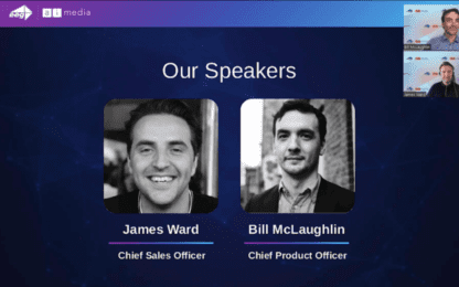
Captioning Solutions for Sporting Events and Venues
Webinar on Captioning Solutions for Sporting Events and Venues
Read more
 Webinar
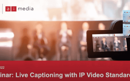
Live Captioning with IP Video Standards | APAC
Webinar on Live Captioning with IP Video Standards | APAC
Read more
Recent Case Studies
 Case study
Amagi Enables Global Reach with Captioning
Ai-Media’s Alta and Lexi Simplify Quality Captions for Cloud-Based Video Solutions Provider
Read more
 Case study
Recent Whitepapers
Ready to Talk?
Get in touch with our friendly team to learn how you can drive sustainable growth by partnering with AI-Media.